
A brand refresh of the aerospace engineering company Jet Propulsion Laboratory. My goal with this rebrand was to update the visual language, provide a more futuristic and unique design scheme, and the driving narrative of the identity was to focus on education, exploration, and inspiration.
IDENTITY


The new logo is made to reference upward movement and kinetic energy. The shape language has been completely overhauled to a more futuristic design. The logo animations are a reference to the Moon coming into view from behind the Earth.

The new typefaces lend themselves to strengthen the idea behind the new futuristic design. Rounder typefaces were chosen for the header and body to make the design more friendly and approachable.

The colors Absolute Blue is in reference to absolute zero, the lowest possible temperature on the Kelvin scale and Voyager Yellow is in reference to the golden record on Voyager 1.


Simple/stylized images focusing on one subject use a duotone grunge effect, a black and white threshold effect or a duotone bitmap effect. This gives images texture, making the audience have a sense of texture of the image subject. Color keeps the image vibrant and interesting to hold attention.
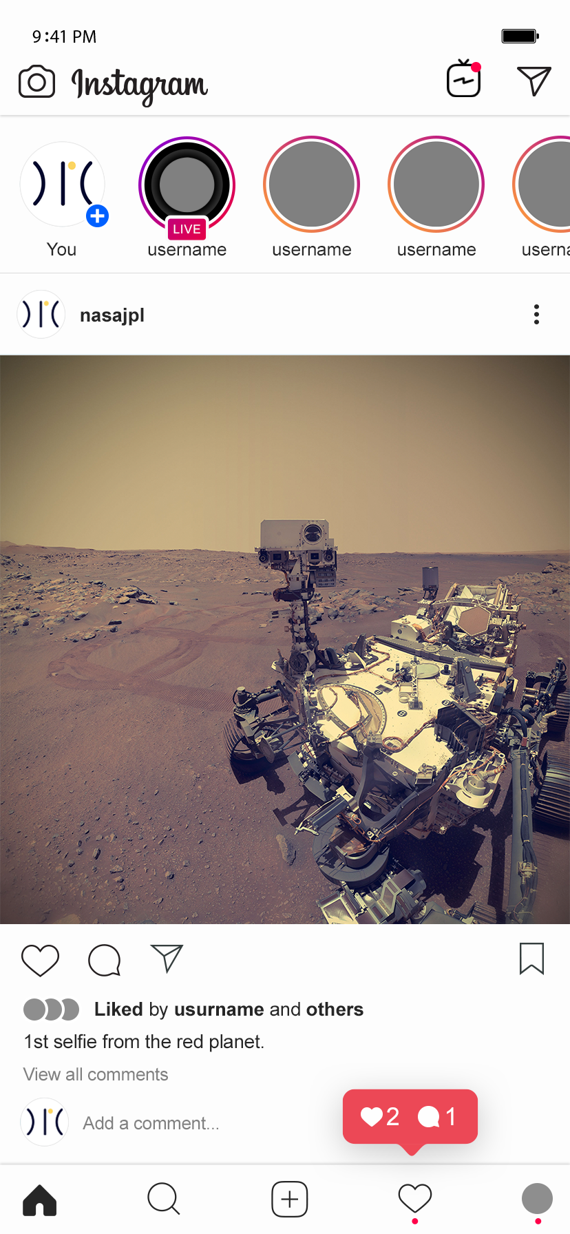
Institutional images will have a light overlay of the brand colors with a blur and vignette in the corners to preserve detail.
IDENTITY POSTERS


A series of identity posters were developed using the logo and a developed image to replace one section of the logo while providing a small blurb of information about the featured subject to focus on education and inspiration.
INFOGRAPHIC POSTERS


The infographic posters highlight three tools that humanity has used to explore beyond the planet and provide information and a diagram on each of the instruments. These posters communicate the new brand narrative of education, exploration, and inspiration.
ILLUSTRATIVE POSTERS


The illustrative posters showcase simpler vector drawings of the solar system and earth with the moon, with information blurbs.
DIGITAL


New website design makes it easier for audiences to navigate and find new articles and stories posted to learn all things JPL and social media posts linked with the new branding.
Going through the process of creating such a large rebrand project taught me to be able to create a connected family of elements that are just more than putting a logo on different pages at different sizes. A narrative identity will be a driving factor in creative decisions. If you can stick to the narrative, it strengthens the brand as a whole and brings everything you've created together.